
/01
THE BRIEF
Seven sub-brands competing for attention – and the masterbrand invisible in a suburb where developer reputation moves units.
The original Waterline Place brand had been developed by an external agency before our team came on. The strategy positioned each apartment building and townhome stage as its own sub-brand – Empress, GEM, Merchant, The Bower, Piper, Lonsdale, Lysander – with AVJennings sitting outside the architecture entirely.
In practice, it didn’t work. The sub-brands competed with each other for attention. Waterline Place – the brand that should have been signalling place to a Williamstown buyer – kept getting drowned out by its own children. And AVJennings, with 90 years of brand equity, was invisible in the consumer-facing system. In a sophisticated bay-side suburb where developer reputation moves units, the masterbrand was contributing nothing.

/02
APPROACH
The fix was structural, not cosmetic. We restructured the relationships between the brands.
We didn’t redo the visual identity work already in market. We restructured the relationships between the brands. The new architecture was three tiers in clear hierarchy: AVJennings at the top, anchoring developer credibility. Waterline Place at the centre, doing the place-making work as a Williamstown landmark. Release names – Empress, GEM, Merchant, The Bower and the rest – demoted from competing sub-brands to what they actually were: stages within a precinct.
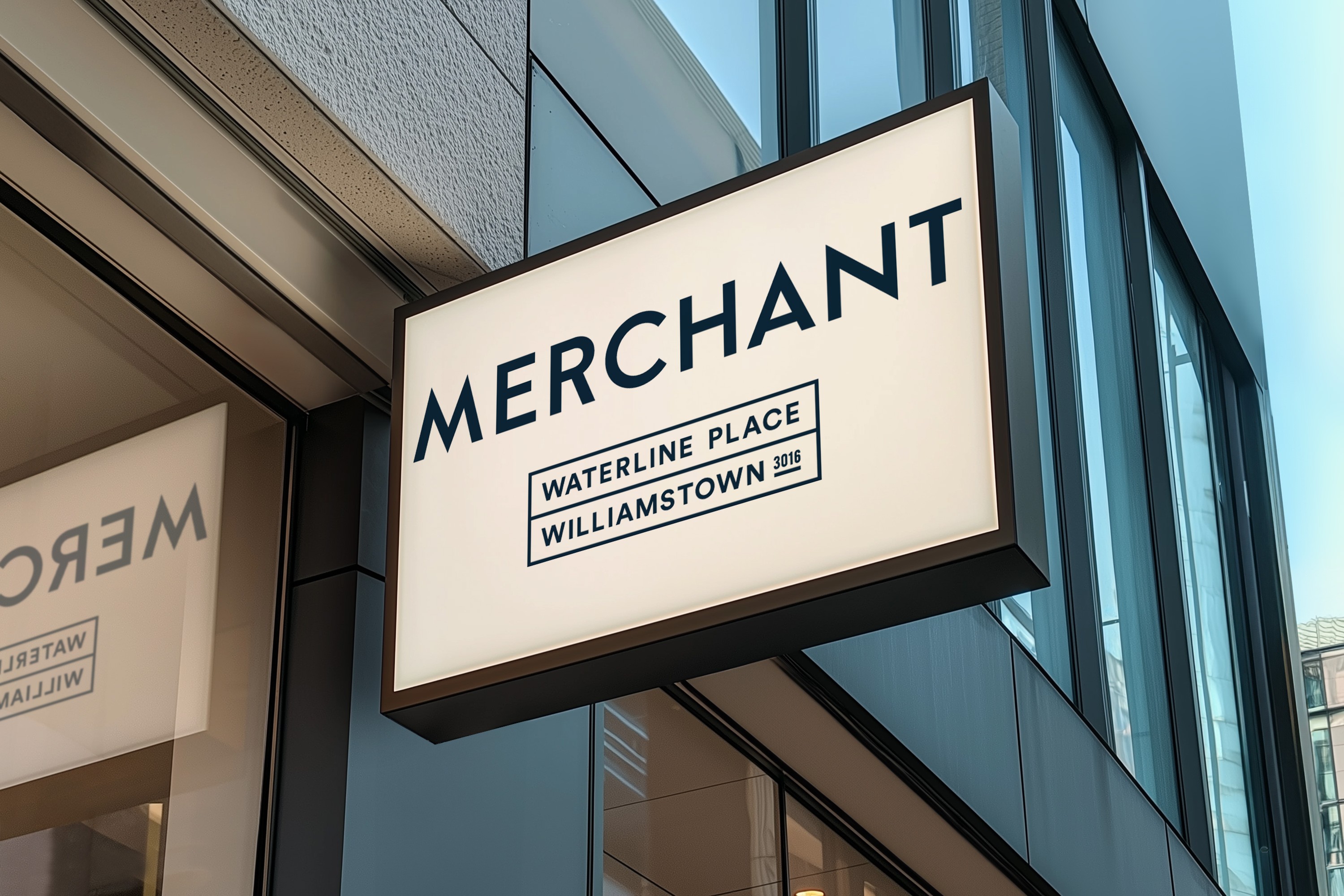
The reset rolled across every customer-facing surface. Sales materials, digital brochures, campaign collateral – all rebuilt to carry AVJennings prominently and Waterline Place as the precinct anchor, with release names in their proper supporting role. The Merchant collateral set, the 8K render package, the interactive digital brochures – each one rebuilt under the new architecture.
The precinct entered multi-year delivery under the reset. Each new release extends the brand without fragmenting it.
/03
WORK DELIVERED
Brand & Place
Brand-architecture reset – three-tier hierarchy documented and applied
Waterline Place precinct style guide – rewritten under the new architecture
Merchant identity assets – restored within the precinct hierarchy
Sales & Experience
Merchant sales collateral – brochure, warranty guide, presentation guide
Merchant billboard, full-page ad, DM card
8K render package – exterior, kitchen and living, mastersuites, ensuites, balconies, rooftop
Digital & Campaigns
Interactive digital brochures – Merchant Townhomes and Merchant Apartments
Multi-release activation – same architecture applied across The Bower, Piper, Lonsdale, Lysander, Empress, GEM


/04
OUTCOME
The hierarchy held. Every release since has extended the precinct brand instead of fragmenting it.
AVJennings now anchors every customer-facing surface, Waterline Place does the place-making, and the release names sit in their proper supporting role. The precinct has carried three UDIA Victoria awards and completed Merchant Apartments in FY24 – all under an architecture reset that cost a fraction of a rebrand.
3-tier
ARCHITECTURE RESTORED – HOLDING ACROSS EVERY CUSTOMER SURFACE
3
UDIA VICTORIA AWARDS – HIGH DENSITY, SMALL SCALE, EXCELLENCE IN DESIGN
FY24
MERCHANT APARTMENTS COMPLETED – FIRST HOMEOWNERS MOVED IN
No rebrand
COST – RELATIONSHIPS RESTRUCTURED, NOT IDENTITY REDONE
“
We didn’t need another rebrand. We needed the brands we already had working in the right order. That’s exactly what we got.
– GENERAL MANAGER VICTORIA, AVJENNINGS
Sometimes a precinct doesn't need a new brand. It needs the existing brands put in the right order.
The fix that costs less than a rebrand – and works better than one.
NEXT PROJECT
Pro9 →
BRAND & WEBSITE · CONSULTING + STUDIO