
Rosella
Rise.
/01
THE BRIEF
Five colourways from the parent palette, one constant anchor – and a brand flexible enough to carry a coastal community without losing the masterbrand.
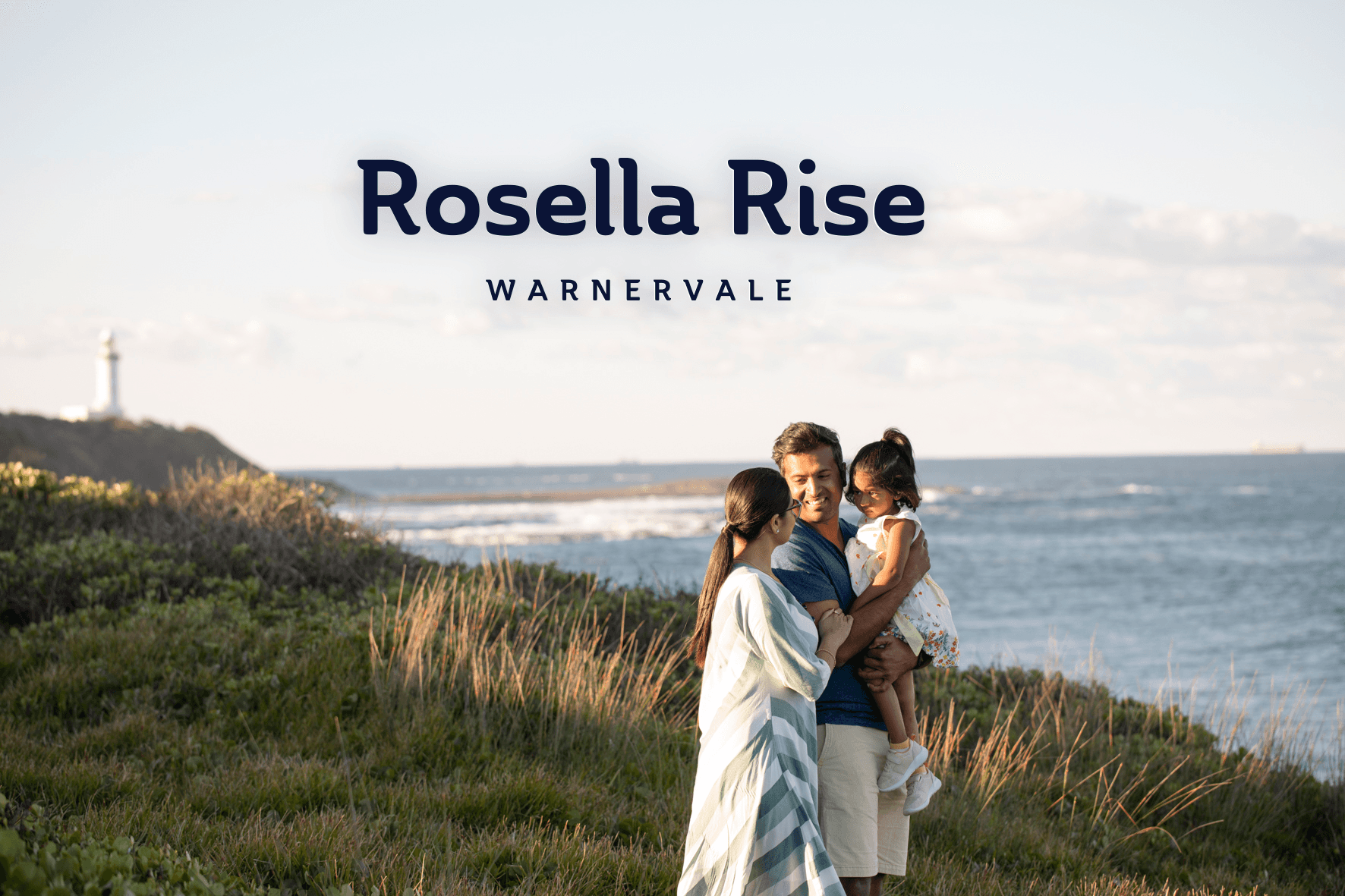
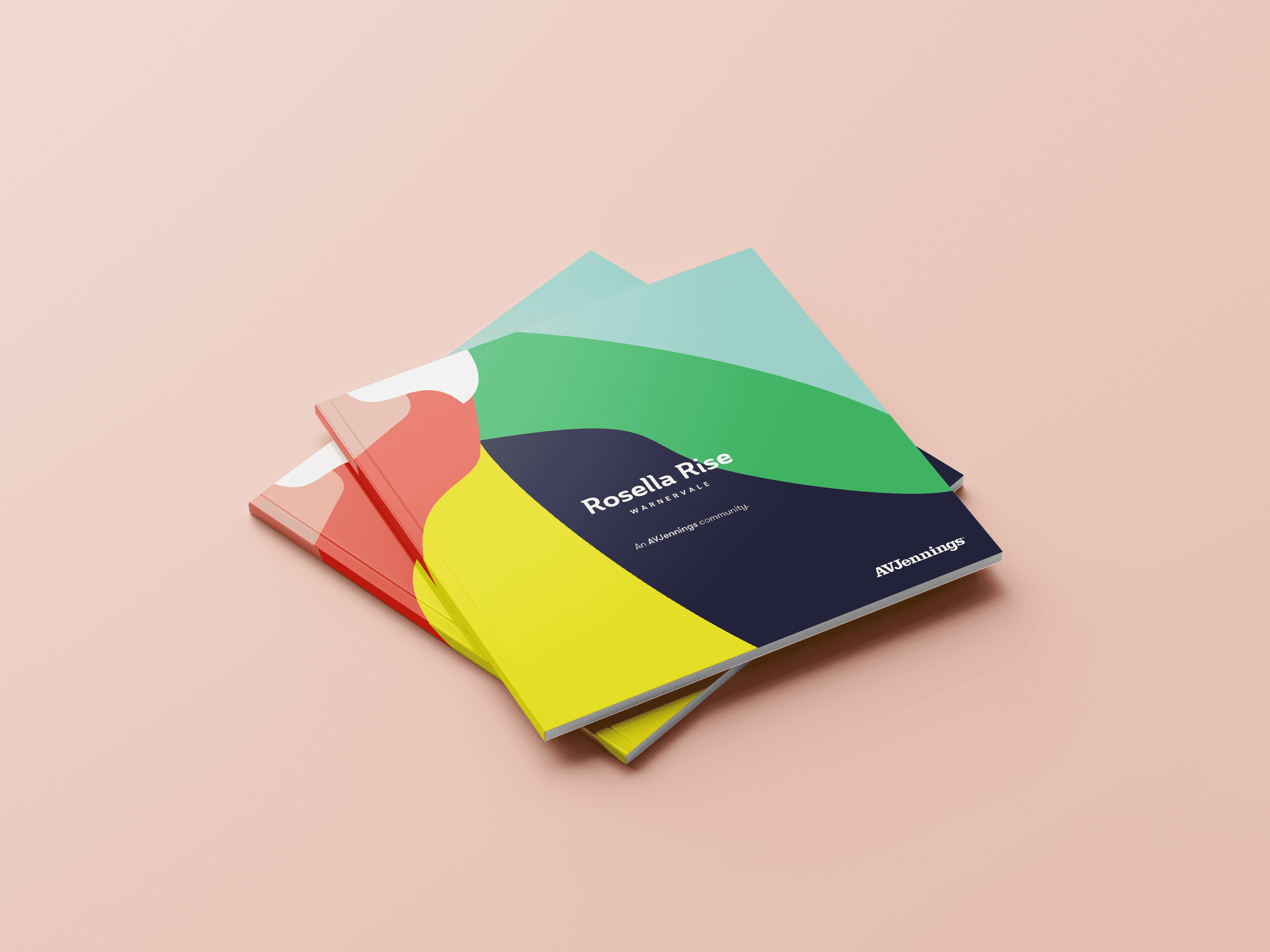
AVJennings’ parent palette held the equity. The brief for Rosella Rise wasn’t to replace it – it was to work inside it and still give the community its own identity. Five colourways drawn from the parent system, each shifting the mood without breaking the family. One graphic device – the Pattern – running through every application to hold it all together.
The constraint was the point. If Rosella Rise could prove that a community brand can flex within the parent palette rather than fighting it, the model would be worth repeating across the portfolio.
/02
APPROACH
The Pattern held the brand together. The colourways gave it range.
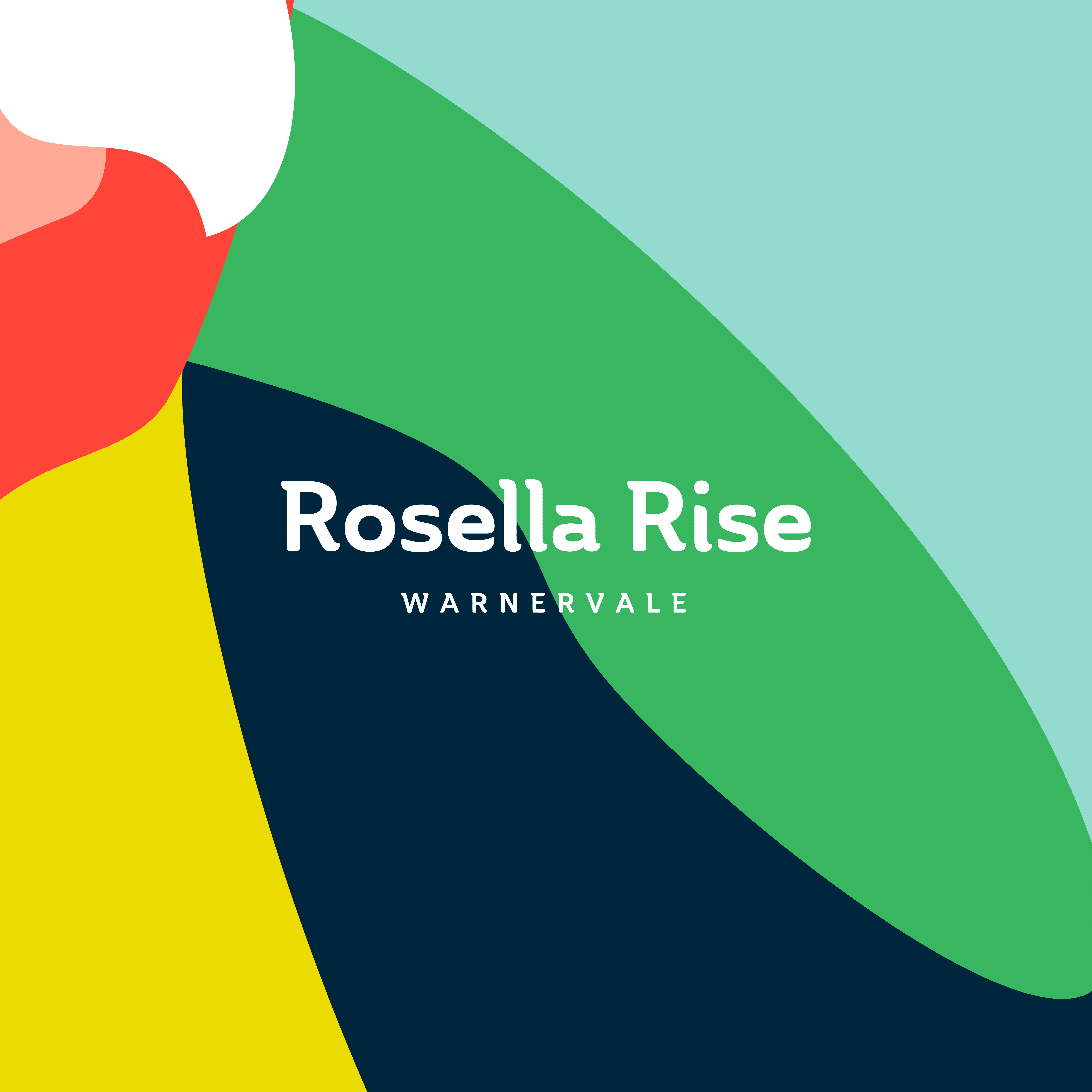
Most community brands in the AVJennings portfolio started from scratch – new palette, new type system, new visual language. Rosella Rise started from the parent. We took the five approved colourways and assigned each one a mood: coastal, bushland, sunrise, sandstone, nightfall. Same palette, five different atmospheres. The constraint forced creativity rather than limiting it.
The Pattern – a graphic motif derived from the Rosella wing – became the constant. It appeared on every colourway variant, every format, every touchpoint. Where the colourway shifted the temperature, the Pattern confirmed identity. A buyer seeing the yellow variant and the blue variant three months apart would still recognise Rosella Rise without reading the wordmark.
The system was deliberately built to prove a point to the broader portfolio: parent-palette deployment doesn’t mean generic. It means disciplined. The brand guidelines documented not just the identity, but the logic – so the thinking could travel to future communities without starting from zero each time.
/03
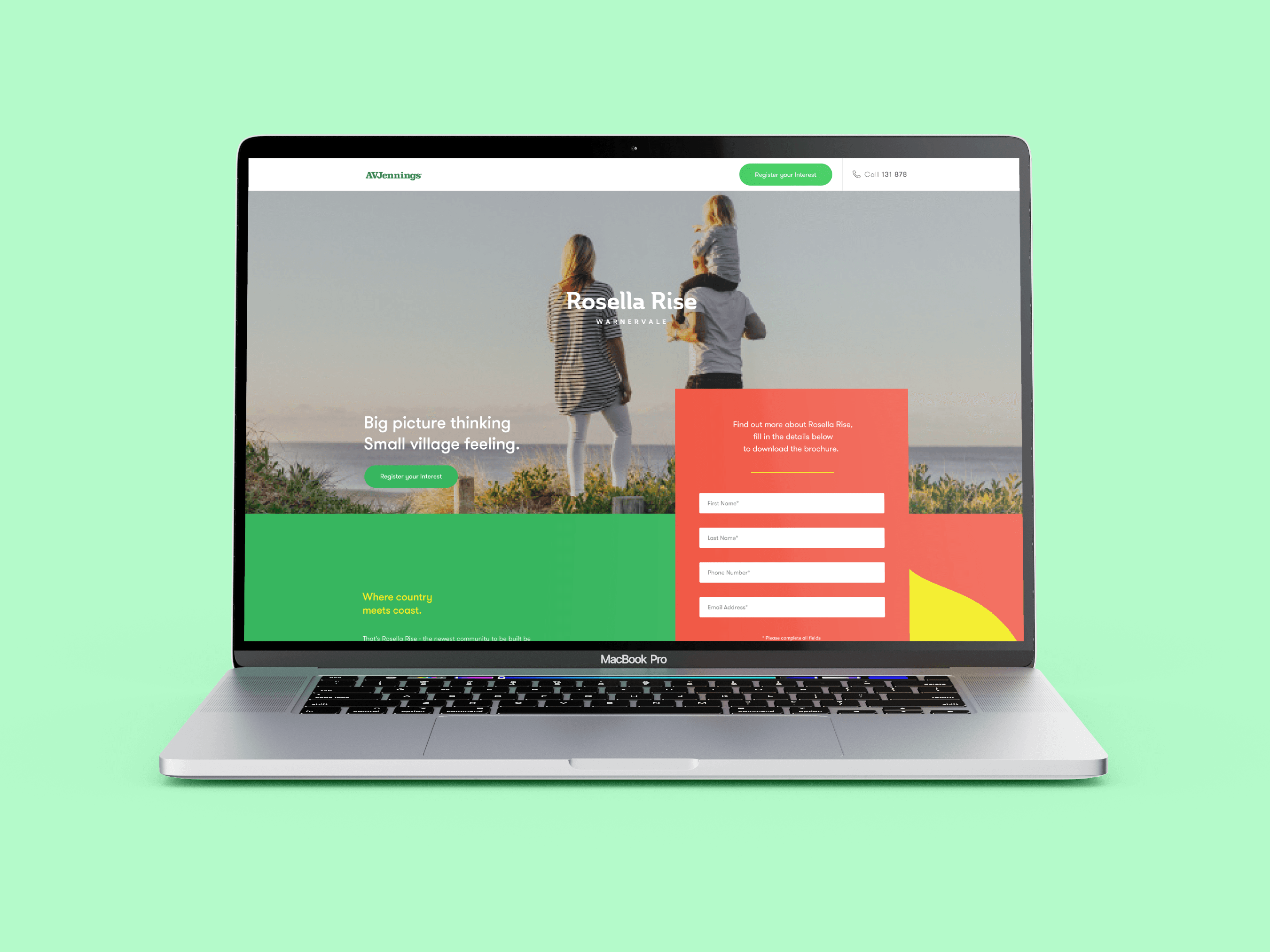
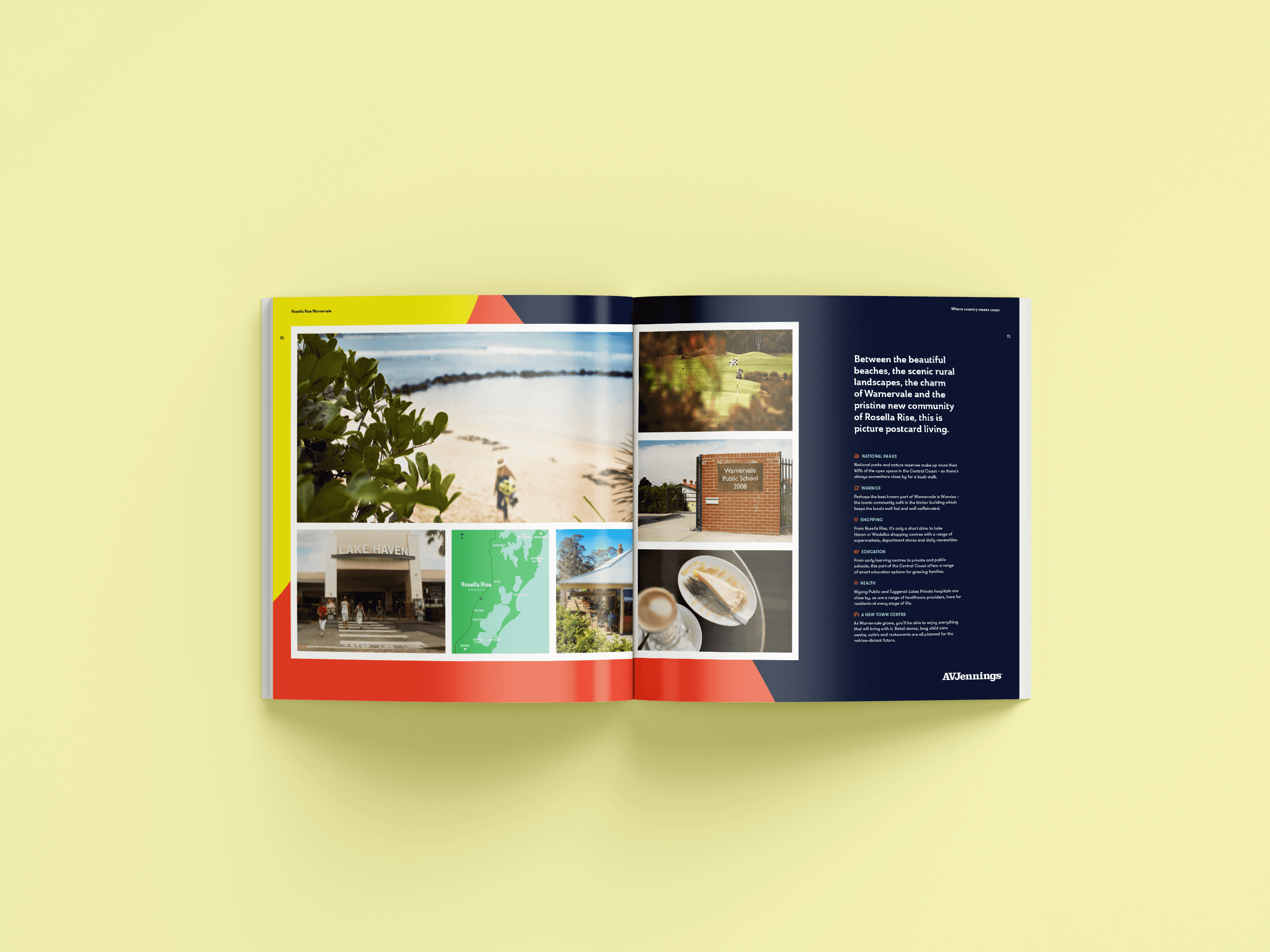
WORK DELIVERED

/04
OUTCOME
Rosella Rise proved a community brand could flex inside the parent palette without diluting it.
Five colourways carried five distinct moods across every application, while the Pattern held the identity constant. The model became a precedent for the broader portfolio – parent-palette deployment as a discipline, not a compromise – and the lessons fed directly into the AVJennings masterbrand refresh that followed.
5 → 1
BRAND COHERENCE – FIVE COLOURWAYS, ONE PATTERN
Model
SYSTEM PRECEDENT – INFORMED SUBSEQUENT AVJ COMMUNITY BRANDS
Direct
PARENT IMPACT – LESSONS FED INTO AVJ MASTERBRAND REFRESH
Replicable
PORTFOLIO PRINCIPLE – PARENT-PALETTE DEPLOYMENT MODEL
“
The brief was to bring our master brand and project brands closer together. Rosella Rise showed it could be done without diluting either.
– NATIONAL MARKETING MANAGER, AVJENNINGS
Running a portfolio of communities?
The relationship between your masterbrand and your community brands is worth designing deliberately.
NEXT PROJECT
Aspect Mernda →
BRAND & PLACE · CONSULTING + STUDIO