Cadence
Ripley
A community brand built on the tempo of life rather than the geography of the site — and a visual rhythm designed to keep playing across every release stage.
CLIENT
AVJennings
SEGMENT
Masterplanned community — land + house & land
IMPACT
A community brand that claims pace of life rather than place — differentiation in a homogenous greenfield corridor
LOCATION
Ripley, QLD
VERTICALS
Consulting + Studio
YEAR
2021–ongoing
/01
THE BRIEF
Enter one of Queensland's busiest greenfield corridors without landing in the middle of the shortlist.
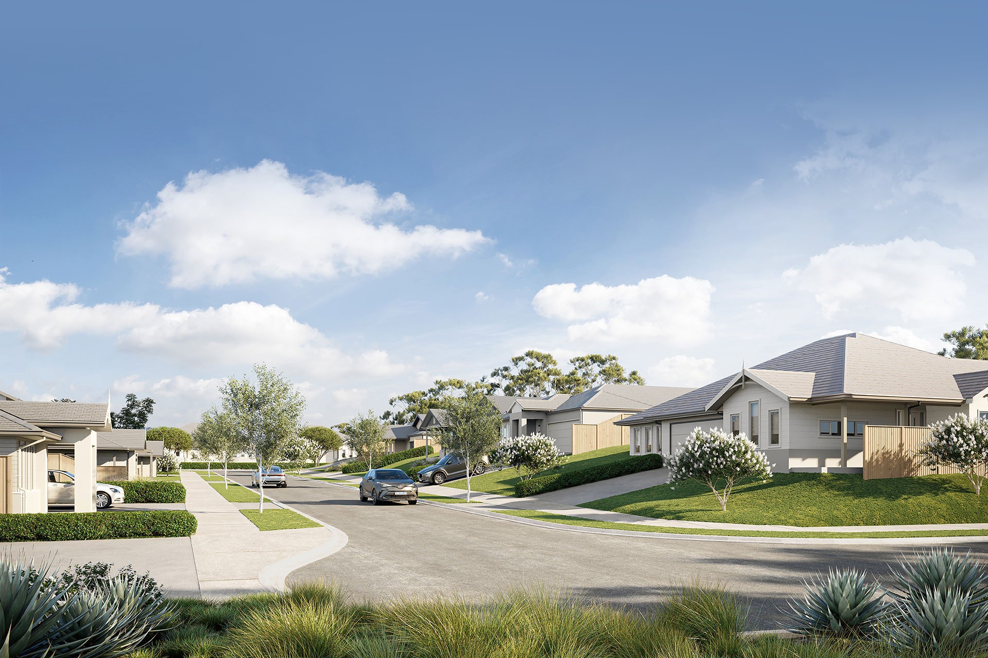
Ripley Valley is one of Queensland's most active greenfield growth corridors, with multiple major developers releasing into the same buyer pool — young families and first-home buyers looking for affordable house-and-land within commuting distance of Brisbane and Ipswich. The standard greenfield playbook is well-worn: a name borrowed from the landscape, a soft naturalistic palette, lifestyle photography of a couple walking a dog. A new release entering on the standard playbook lands in the middle of the buyer's shortlist by default — and the middle of the shortlist is where projects die.
The calibration was between accessible and deliberate. A brand that read as too aspirational would create a price-perception mismatch the project couldn't recover from. A brand that read as too soft would lose to more deliberate competitors. Both had to hold.


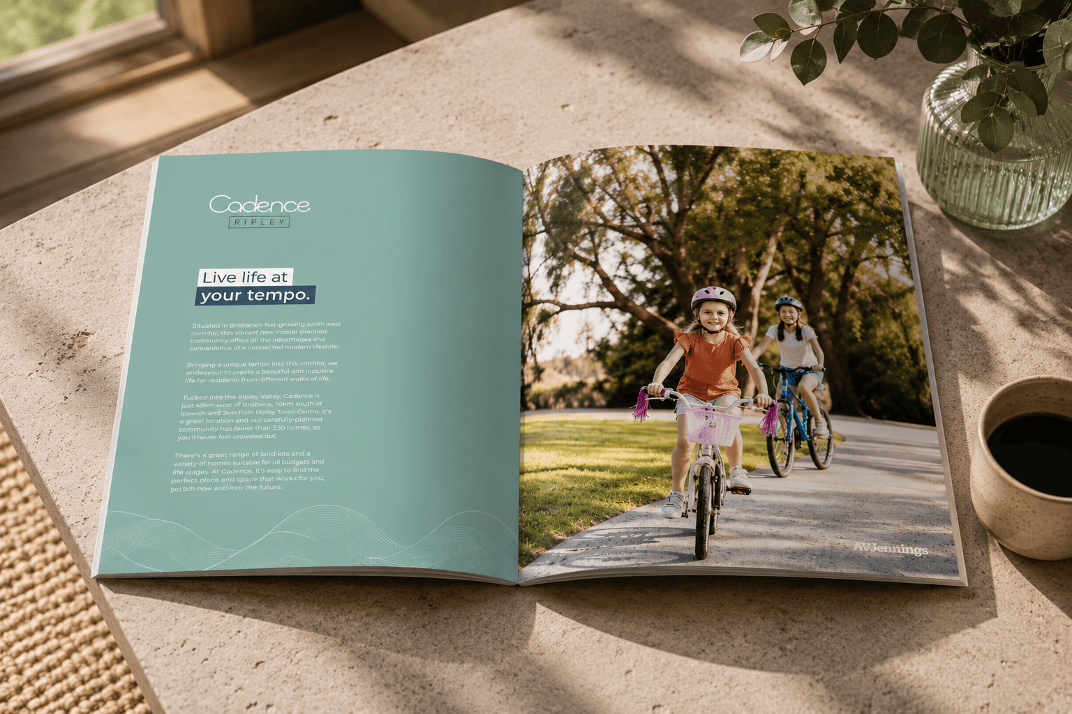
The wave-rhythm motif — one DNA, assembled differently for every release stage.
↓ APPROACH
/02
APPROACH
Claim the tempo, not the place.
The differentiation had to come from a positioning move, not a product move. The angle we landed on was the pace of life. The Ripley buyer — a young family leaving inner Brisbane or Ipswich for more space — was implicitly making a decision about the tempo they wanted their life to run at. Not the place. The tempo. The brand could claim that decision directly. The name Cadence came from that positioning, and the tagline — Live life at your tempo — compresses it into five words. Most community taglines describe the place. Cadence's tagline describes the buyer.
The visual identity translates tempo into rhythm. The central design device is the wave — left-to-right and right-to-left curves working at every scale: a rule across a brochure cover, a hero device on a website block, a frame for lifestyle photography. It was designed as a system, not a single mark — the same DNA assembled differently for each release stage. The palette pairs dark teal, mint, mid teal and warm gold — composed and accessible at the same time. Typography pairs Ofelia's display warmth with GT Walsheim's clean readability — deliberate without sliding into corporate-formal.
The buyer-type imagery was the other lever. Cadence stepped sideways from the category default — active young families, friends on bikes, kids riding together. The imagery reads as a community in motion rather than at rest: tempo, visualised at the imagery layer.
/03
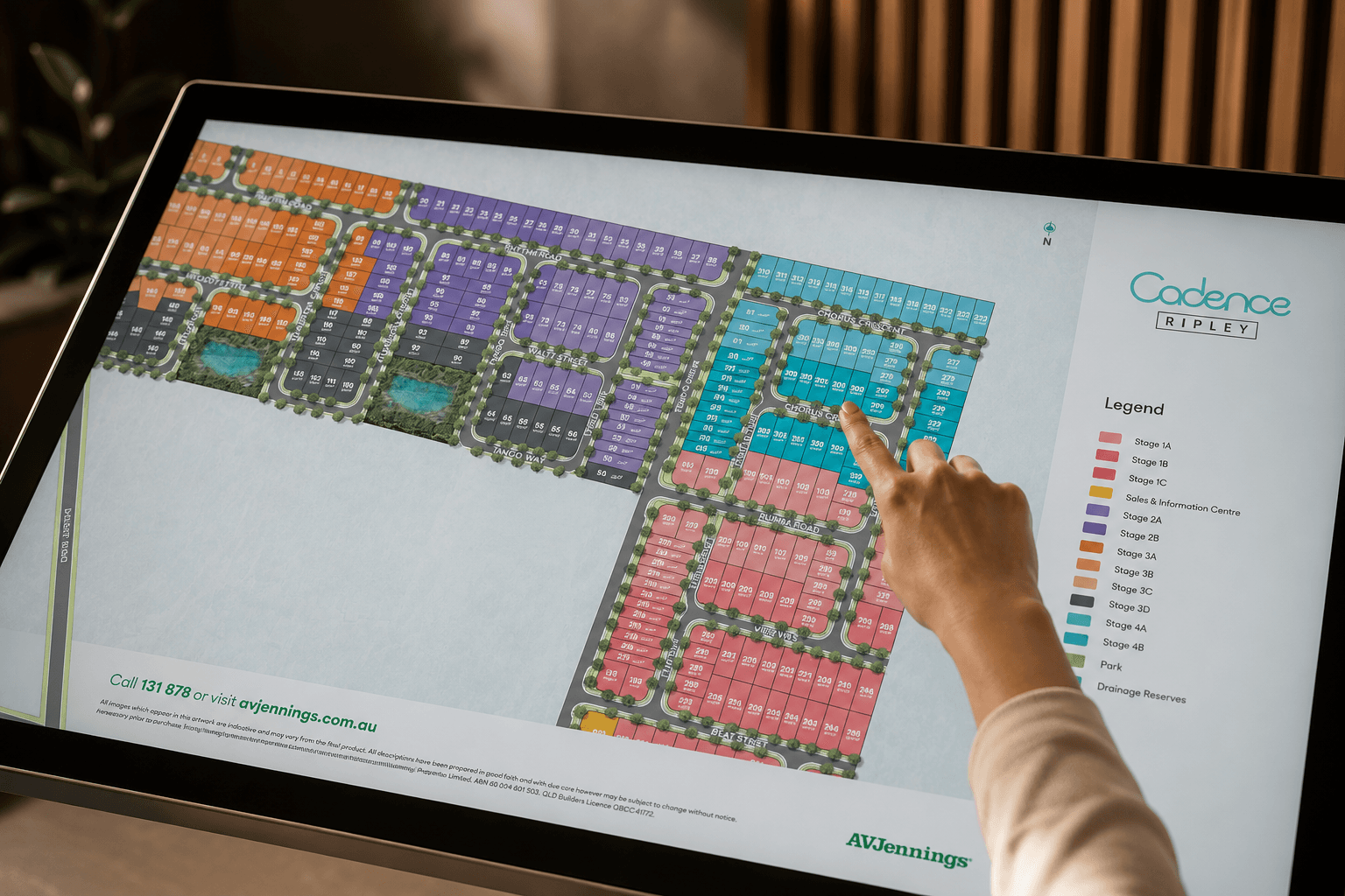
WORK DELIVERED
Brand & Place
Brand identity — name, wave-rhythm motif system
Tagline — "Live life at your tempo"
Palette and typography — Ofelia + GT Walsheim, brand Style Guide
Print & Sales
Print suite — brochures and sales collateral
Lifestyle photography direction — a community in motion
Digital & Campaigns
Interactive digital brochure
Campaign extensions — evolving release by release
/04
OUTCOME
Cadence went to market claiming a structurally different position — tempo, not place.
The brand stepped out of the standard greenfield-corridor playbook: active community rather than passive lifestyle. The wave-rhythm system carried it consistently across print, digital brochure and campaign extensions, and across the release stages that followed, without needing a reset. Inside the Queensland portfolio, Cadence sits alongside Arbor — evidence the approach scales across corridors of the same state without converging on a single visual default.
Tempo
POSITIONING CLAIMED —
PACE OF LIFE, NOT PLACE
5 words
LIVE LIFE AT YOUR TEMPO —
THE WHOLE POSITIONING, COMPRESSED
No reset
WAVE-RHYTHM SYSTEM HELD ACROSS
EVERY RELEASE STAGE

"
Every estate in the corridor was selling the suburb. Cadence sold the pace of life. That's what cut through.
— QLD MARKETING MANAGER, AVJENNINGS
Most greenfield brands describe the place. The buyer is choosing a pace.
We're worth talking to before the name is locked, not after.
NEXT PROJECT
Waterline Place →
BRAND ARCHITECTURE · CONSULTING + STUDIO