
Arbor
Rochedale
CLIENT
Arbor
IMPACT
Boutique brand that earns the word boutique through expression, not by claim
VERTICALS
Consulting + Studio
SEGMENT
Boutique residential (townhomes)
LOCATION
Rochedale, QLD
YEAR
2021
/01
THE BRIEF
How do you make the word boutique mean something when every competitor is claiming it?
Rochedale’s competitive set was full of boutique townhome projects using the same vocabulary – refined, considered, premium – and reaching for the same softly decorative brand language. A buyer comparing the shortlist landed on a logo, a colour palette, a sales centre, a brochure.
The brief was to develop a brand identity for Arbor. The harder problem underneath was how to make the brand earn the word boutique through expression rather than just claim it on the cover.

/02
APPROACH
Start with the site, not the brand language.
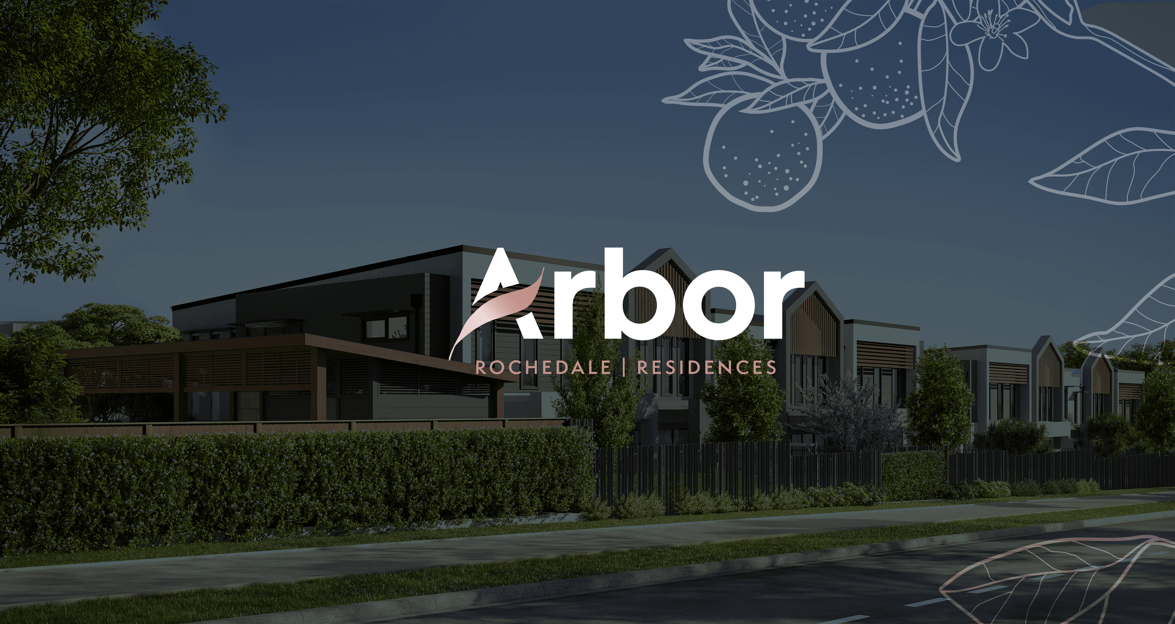
We started with the site, not the brand language. Rochedale’s defining quality is its canopy – a leafy southern-corridor pocket where the natural environment is a real lifestyle asset rather than a positioning claim. The name Arbor came directly from that canopy. It carries shelter, growth, and community in a single word.
The visual identity was built around the central duality the project itself embodies. Clean architectural lines do the modern-residence work. Organic textures and a soft, natural palette do the canopy work. The two languages sit together inside the system rather than competing – used together they make the brand feel like the project: architecture inside nature, not architecture and nature.
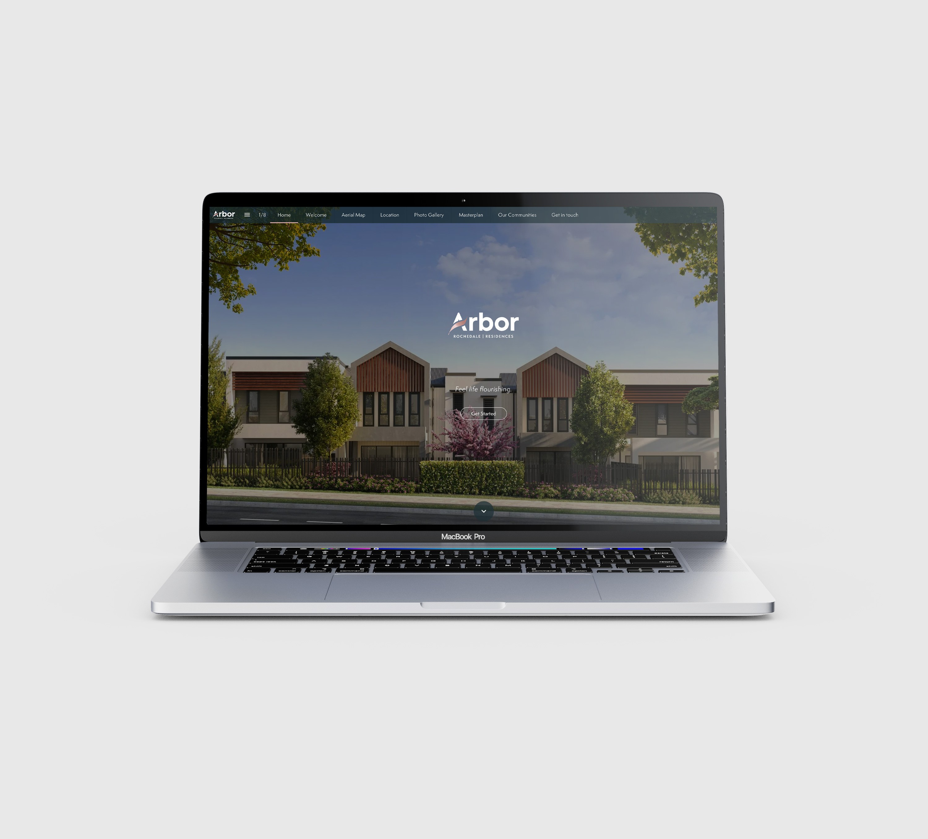
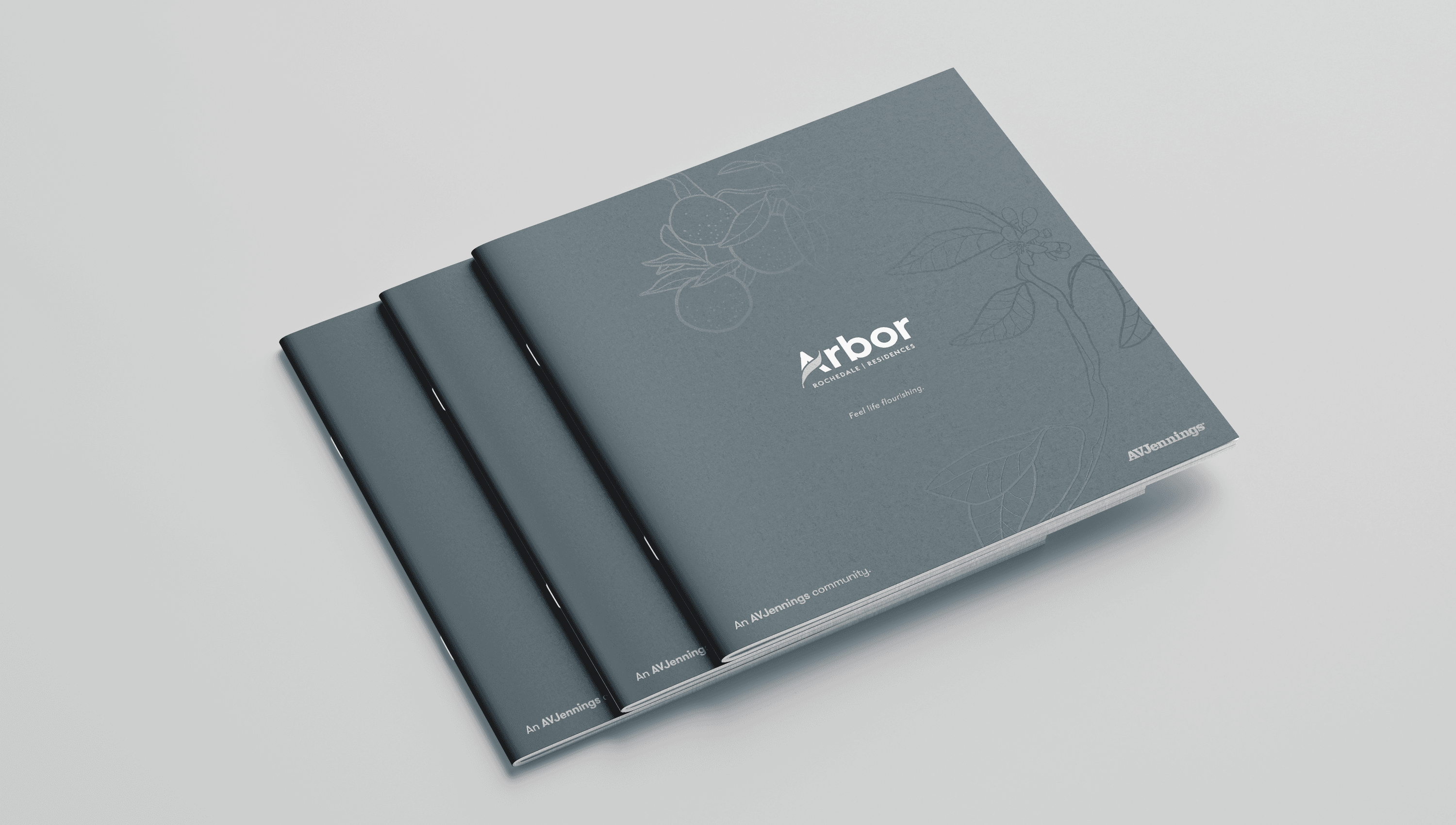
The identity then rolled across the full application set the boutique segment depends on: brand suite, print brochures (the stacked trio that became the anchor sales artefact), display assets across the sales centre, and a live interactive digital brochure that extended the brand language from print into the buyer's online research journey.
/03
WORK DELIVERED


/04
OUTCOME
Arbor went to market with a brand expression that earned its boutique positioning rather than claiming it.
The visual identity carried the project through the print suite, the display environment, and the digital brochure – a continuous brand experience from first impression to final decision. The duality at the centre of the work – refined architecture set inside a green, welcoming environment – translated cleanly into a brand system that captured what makes Rochedale, and Arbor inside it, distinctive.
ILLUSTRATION BY TINY GIRAFFE CO
Full suite
BRAND, PRINT, DIGITAL, SALES CENTRE – DELIVERED AS ONE SYSTEM
Duality
ARCHITECTURE INSIDE NATURE – THE CONCEPT THAT UNIFIED THE BRAND
3 brochures
STACKED TRIO – THE ANCHOR SALES ARTEFACT FOR THE PROJECT
Earned
BOUTIQUE POSITIONING THROUGH EXPRESSION, NOT CLAIM
“
Every competitor was claiming boutique. We needed a brand that actually earned it. This one does.
– PROJECT DIRECTOR, AVJENNINGS
Boutique projects punch above their size when the brand is built from the site.
We’re worth talking to before the name is locked, not after.
NEXT PROJECT
Harvest Square →
BRAND & PLACE · CONSULTING + STUDIO