
/01
THE BRIEF
Mernda's last land estate. A site beside Quarry Hills with views that don't expire. Build a brand that gets out of the way and lets the location speak.
Aspect occupies the last available land parcel in the Mernda suburb – a fact AVJennings carries directly in its own positioning: Mernda’s last land estate. For a buyer in this corridor, that wasn’t a marketing claim. It was a commercial reality.
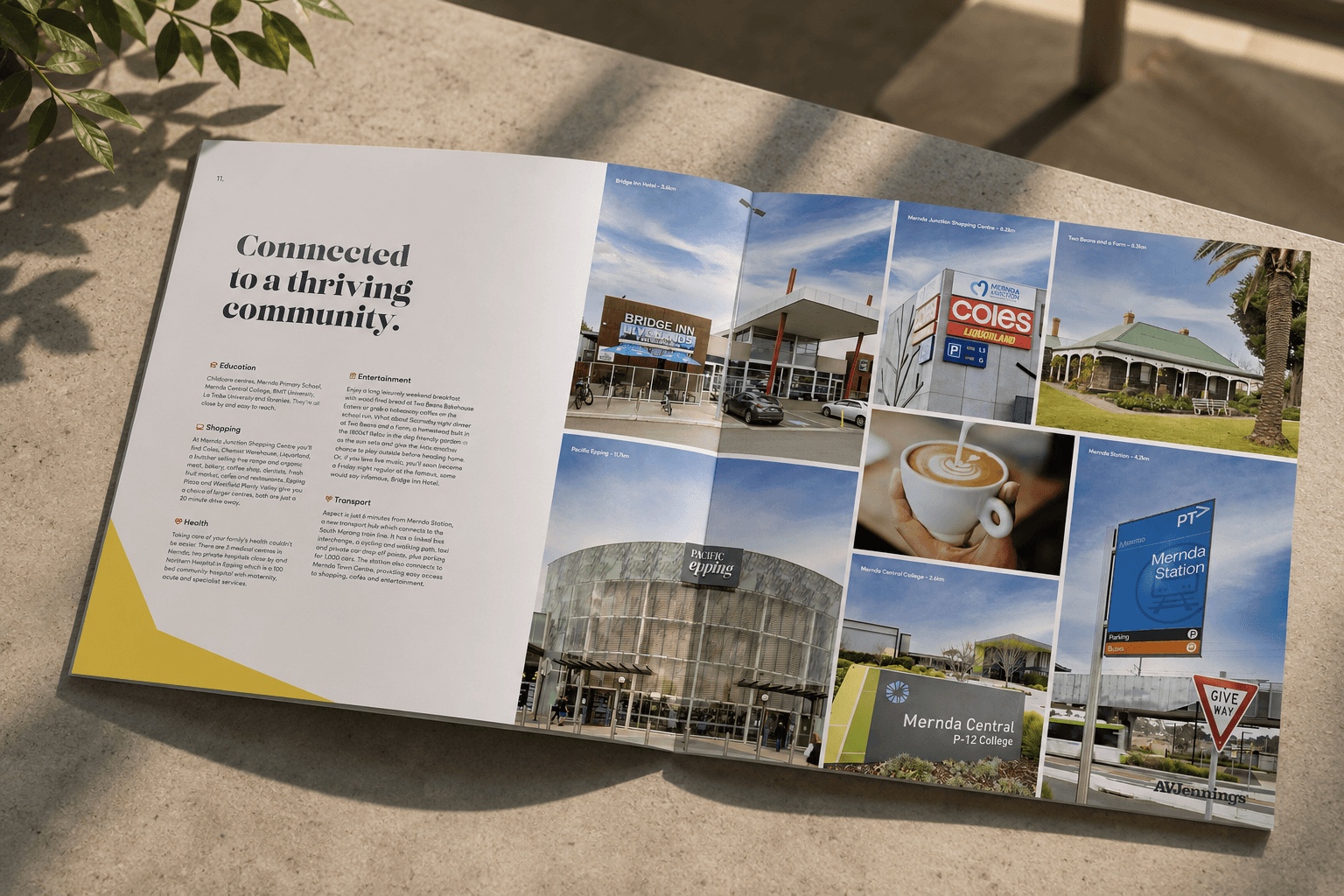
The site sat beside Quarry Hills Regional Park, with bushland and views on one boundary and a vineyard on another. Whatever block a buyer chose, the surrounding aspect – the outlook, the natural backdrop, the sense of openness – was a durable feature. Most master-planned communities have to argue for their location. Aspect’s location argued for itself. The brief was to build a brand that got out of the way and let it.

/02
APPROACH
The star is the shape of the land itself – not borrowed, pulled directly from the site.
The name came from the north star – a navigational reference, an orientation point. But the visual identity needed to earn the star a second time. When we traced the boundary of the estate on a plan, the geometry suggested a star. We turned that into the design language. The star device is the shape of the land itself – not borrowed from a symbol library, pulled directly from the site the brand belonged to.
That sense of inevitability – the feeling that the brand could only have come from this place – is rare in community brand work. It comes from treating the site as the design source rather than a backdrop to summarise in a moodboard.
The identity has run through multiple release stages since launch in late 2021, with final land releases now selling.
Five-colourway identity system and sales centre – the star device anchoring every application.
↓ WORK DELIVERED
/03
WORK DELIVERED
Brand & Place
Brand identity – star device drawn from the estate’s geometry
Five-colourway logo system – navy, white, grey, yellow, black
Colour palette, typography, brand guidelines
Sales & Experience
Sales centre and display village fitout direction
Brochure, masterplan, lot release materials
Out-of-home – site signage and billboards
Digital & Campaigns
Digital advertising system
Interactive digital brochure on the AVJennings publishing platform
Multi-stage release activation through to current Stages 6 and 7
/04
OUTCOME
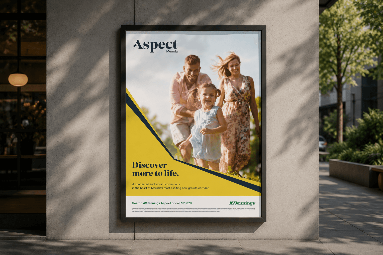
Aspect launched as Mernda's last land estate and carried the same identity through to its final releases.
The star device held every application together – sales centre, signage, brochures, digital – across multiple release stages, with no mid-life rebrand and no creative reset. A brand built from the site stayed true to it, and the project was named a contributor in the AVJennings FY24 annual report.
Last
MARKET POSITIONING – MERNDA’S LAST LAND ESTATE
Open
DISPLAY HOMES – FIRST AVJENNINGS HOUSING PIPELINE COMPLETE
FY24
CONTRIBUTOR – NAMED IN AVJENNINGS ANNUAL REPORT
No reset
BRAND LONGEVITY – SAME IDENTITY LAUNCH THROUGH FINAL STAGES


"
The brand never needed rescuing. It came from the site, and it held from the first release to the last.
– AVJENNINGS VIC MARKETING TEAM
Your site has a geometry, a boundary, an orientation, a context.
Most briefs treat those as inputs. We treat them as the source.
NEXT PROJECT
Prosper →
BRAND & PLACE · CONSULTING + STUDIO